
Some Criticisms of Local Architecture
(This piece is a composite of people's comments over the years,
and does not represent the official position of any one individual)
Where did
Columbia go wrong architecturally? First,
Low Library, although a spectacular building, never really worked as a library because it has too little space to store books. It is nowadays used for University functions and celebrations and, sadly, as a home for bureaucrats. Next, John Jay is taller than it should be relative to the surrounding buildings.
The ugliest modern building on campus is probably
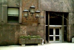
Mudd, the engineering building, a Soviet-esque 1950's concrete brick that makes no discernable attempts to even HAVE an architectural style, not even the high-tech functionality one might reasonably ask for in an engineering building. You can almost hear the Sputnik-induced panic: "build us an engineering building as fast as possible - it doesn't matter what it looks like, just get it built!" Its utter indifference to aesthetics shows in the fact that this modern building has 19th-century coachlamps (!) next to its north entrance. The next-door Biology building, Sherman Fairchild Hall, at least looks like Technology and Science.The newest engineering building,
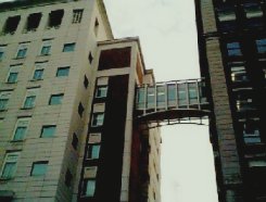
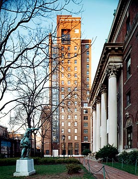
Schapiro, is a muscular and polished techno-classical structure that makes a fine (and much needed) focus for the north end of campus, though its mixture of reactionary style and high-tech execution is a bit weird, even fascistic. Albert Speer would have liked this building. Its matching pedestrian bridges reach out from each side to Pupin and Mudd to unify the sciences complex of campus in a way that can only really be appreciated from 120th Street.East Campus, a slab with a courtyard of "townhouses" attached, was supposed to be inspired by the quads of Oxford, Cambridge, Harvard etc. Few will be deceived. However, the student suites within are quite large and pleasant. Many of the suites have interesting multi-floor arrangements. Barnard's Sulzberger Tower , designed by James Stewart Polshek, former Dean of Columbia's architecture school and a leading exponent of "contextual" architecture, deserves a prize for the way it harmonizes with the existing buildings and produces an attractive quadrangle. This or the new engineering building is the best structure Columbia has built since WWII. Its only flaw is some rather pointless bristling of postmodern geegaws at the
top of the tower, which nonetheless makes the civilized traditional gesture of having flags and a clock. Early drawings of this building showed it with a traditional peaked copper roof - too bad it didn't end up this way, as
the tower has become the key landmark announcing the presence of
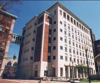
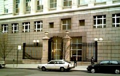
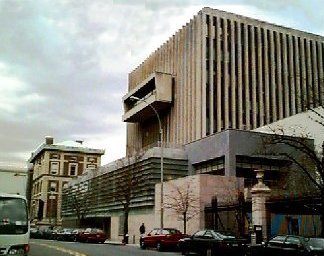
Barnard College to the pedestrian on Broadway.Mr. Polshek's "contextual" style of architecture runs into problems when the building it has to harmonize with is hideously ugly in the first place. The inevitable result: more ugliness, as in the case of his Law School addition. The original building is a dismal brick of 1960's bureaucratic modernism, complete with a bloated and formless sculpture that hangs ominously over the entrance, perhaps alluding to the intellectual incoherence contained within, perhaps merely threatening to crush the unlucky pedestrian. This building was nicknamed "the toaster" because of two balcony-like structures protruding from each end. This building would be a lot less ugly if its elaborate system of built-in window boxes for plants were used, but they hardly ever are.The new addition, for all its desperate efforts to jerk this dismal brick into some semblance of crisp high-tech glamour, has the warmth and character of a 1970's airport lounge. Perhaps this is appropriate symbolism for a spawning-ground for the polished cynicism of young corporate lawyers. Its vast frosted upper windows and almost windowless first floor suggest the contempt of private power for the public. There is absolutely nothing in this building to suggest that law in a civilized society might be based on thousands of years of traditions - it is just empty technocratic cleverness with expensive furnishings. But this is not really the architect's fault, given what he had to work with. What is, is that the entrance is far too inconspicuous and is marked only with a weird curved flange of an overhang. Nevertheless, this is a disciplined and precise building and at night it even has a certain Corbusian radiance. Polshek also designed the Law Review building across the street, whose too-sharp postmodern style clashes with the elegant apartment houses next to it. This building bristles with empty technological gestures, such as its weird glass entrance awning, like a geek among gentlemen. Still, the building upholds the street wall, is faced mostly in brick, and the glassed-in lounge at the top is a not uninteresting element. More Pictures.Schapiro, a Columbia dormitory by the same
Gruzen Samton firm that has since done Columbia's new
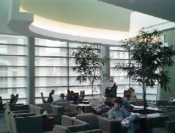
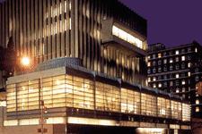
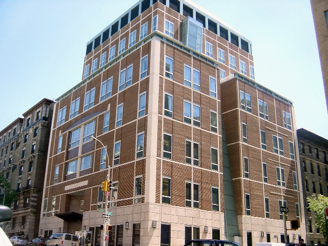
Jewish Center, escapes the featureless boring banality of most modern architecture and has an interesting and restrainedly colorful facade, but it is somewhat out of place in the neighborhood and does not harmonize with any of the buildings around it.Columbia College is currently constructing a new and expensive student center, Lerner Hall, where the old student center, Ferris Booth Hall, used to be. Judging from published pictures (campus view) (Broadway view) , the new building will be a vast improvement over the old one, though an opportunity to build a more traditional building will be wasted. Bernard Tschumi, a Frenchman who is dean of Columbia's architecture school, is the architect. Note 3/15/99: Now that this building is nearing completion, it becomes clearer every day what a snidely arrogant piece of postmodern junk it is. It is loud, clumsy, bristling with pointless technological showing off, and will blight the historic campus for decades. Its glaring north facade of glass poisons the tranquil Beaux-Arts harmony of South Field; the ramps behind it look like a cage for gerbills. The architect is a preening and unoriginal vandal who belongs on the next plane back to France.
Columbia is also constructing a new classroom building for the Business and Law schools at Amsterdam Avenue between 116th and 115th Streets, where the post office used to be. Plans show a civilized and contextual building that will resemble the main Columbia buildings across the street. The only problem is that there will be no retail space on the first floor, creating a dead street and undermining the pedestrian traffic that makes areas safe. Note 3/15/99: Now that this building is finished, it is clear that the architect sneaked in a lot of post-modern weirdness under the cover of a subdued architectural rendering. Can ANYONE figure out what on earth that weird arch-like thing-a-ma-bob over the entrance is supposed to be?
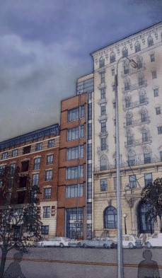
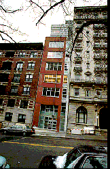
Robert A.M. Stern has designed a new dormitory for Columbia College that will go over the Chemical Bank on Broadway. Preliminary drawings, which were shown at a community meeting on March 24, 1997, show a fine traditionalist building done in red brick (since changed to beige to match the other buildings on Broadway) with limestone-colored trim. The two designs under consideration, one tall and one short, both have a pair of arched entranceways at the base and were popular. People who favored the short design thought that it was more contextual and fitted in nicely with the traditional square mass of a New York apartment building. Those who preferred the taller version called the shorter one "dumpy" and thought the tall one "distinguished" and "dramatic." They also didn't like the "dingy" light well that would be required in the shorter version. Nevertheless, both are stylish and civilized buildings and either would probably be the best structure that Columbia has built since the 1930's. Pictures will be posted when we get some. Here they are. Note 3/15/99:Final(-ish) plans have now been shown to the community. In Mr. Stern we have found, at last, a responsible and cultured architect who is going to give us a building that will actually improve its surroundings. He has made a serious effort to fit in with the surroundings, and it shows.
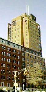
Outside Columbia University, the worst architectural offender in the neighborhood is doubtless St. Luke's / Roosevelt Hospital. St. Luke's was originally a gorgeous French-style building with a cupola, but the front of this building was hacked off (the stump of the dome is still visible from 113th St.) to build a hyperbanal extension in the 1950's. Even worse is the medical office building that was put up across the street, which has a pasty white concrete and brick facade and a setback from the street over a windowless slab of parking garage that breaks the street wall. It cannot even manage a traditional green, curved New York entrance awning, but has a hideous brown metal slab on stalks.

|